
Brand Guide
IIBA® logo is the official identifying mark of the IIBA brand. In addition to the logo, the orange circle/dot must be used sparingly and should stand out as the main visual brand element.
When another language is used with the logo the text is set in the same style as the English language version using IBM Plex Sans. The logo remains unchanged.
Colours
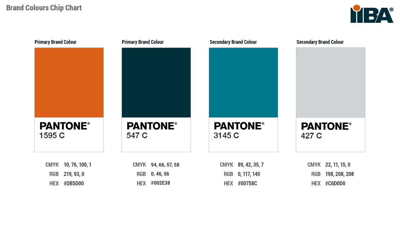
Primary Colours
The primary colours represent IIBA’s brand, as such these colours must be present and consistent across all communications and materials.
IIBA orange is defined as Pantone (PMS 1595 C)
- CMYK 0, 70, 100, 2
- RGB 219, 96, 24
- WEB #D86018
In print, IIBA orange should be printed as a spot colour (PMS 1595 C) whenever possible.
On the Web, # D86018 is used on white and reversed white when used against a solid colour where there is sufficient contrast.
Dark Blue (PMS 547 C)
- CMYK 100, 11, 20, 82
- RGB 0, 49, 60
- WEB #00313C
Secondary Colour Palette
Our secondary palette complements the primary palette. These colours should be used as accents and therefore not dominate a design.
Medium Blue (PMS 3145 C)
- CMYK 100, 0, 24, 30
- RGB 0 119 139
- WEB #00778B
Light Grey (PMS 427 C)
- CMYK 14, 8, 4, 0
- RGB 208, 211, 211
- WEB #D0D3D4
Typography
IIBA’s official fonts are IBM Plex sans and Roboto Condensed (sans serif). These fonts are to be used in all printed materials. Using this font in all printed material will help to establish a consistent look and feel for all of our communications.
Secondary Fonts for Web and Electronic Media
If these fonts are unavailable Calibri, Arial (sans serif) and Helvetica (sans serif)) may be used in their place. These fonts should also be used by anyone who does have access to IBM Plex Sans or Roboto Condensed when creating visual communications such as sales letters, presentations and e‐mails.
Downloads:
Logo Usage
IIBA’s signature logo should be used on all official IIBA publications, websites (iiba.org and Chapter websites), and on promotional materials for events where IIBA is the primary sponsor.
The logo should not be altered. The logo is a trademark and uses other than official IIBA and IIBA Chapter materials may violate our intellectual property policies.
Logo Usage
IIBA Logo and IIBA with Tagline
Sizing, Minimum Length
The tagline logo comprises the two-line (stacked) wordmark. In print, the recommended width is 1.5 inches (9 picas) for readability. On the web, the recommended width is between 150 and 200 px.
The acronym signature should be used in cases where the primary signature is not required. All logos may not be smaller than half an inch in length (0.5”) for readability.
The recommended width is 3 inches (18 picas). On the web, the recommended width is between 300 and 350px.
The tagline logo is designed to be placed left aligned. Text should align with either the left side of the logo or the left edge of the wordmark. Nothing may touch the logo.
![]()
Space should be left around the tagline; at a minimum, the space should be equal to the height of a capital letter at any given size (1/4” or 6.35mm). This applies to both the tagline logo and acronym signature. If the signature used has to be centered or in close proximity with centered text, increase this space so that the text does not look-off center to the eye when mathematically on center.
![]()
No changes can be made to the logo or the placement of the registration mark or trademark. Treat it as an image that may not be touched or changed.
Chapter logo
A. Primary Full Tone Color This is the primary logo to use and your main go-to version of the logo, except for limited exceptions below.
B. White Reversed (Option 1) The white version with orange dot can be used when used against a solid colour where there is sufficient contrast.
C. White Reversed (Option 2) The full white version can be used when used against a solid colour where contrast would be difficult to achieve.
D. Black The solid black version is only to be used for Fax, and some forms of black/white commercial printing applications, such as local newspapers etc., where coarse halftones screens are used.
![]()
Individual IIBA Chapters may use their IIBA Chapter logo provided the guidelines are followed and use of the logo is properly licensed.
Sizing
Minimum Length, Size and Spacing
IIBA logo may not be smaller than half an inch in length (0.75”) for readability.
Specifications for size and spacing below indicated at smallest size.
When enlarging logo all elements must be enlarged proportionally, Bluegrass Chapter logo is shown as an example.
When editing the logo to customize with another Chapter name only edit the first line.
Entire chapter name should be on the first line and “Chapter” should be on the second line as shown below.
Do not change the colours, fonts or placement of Chapter name.
![]()
Trace the growth of IIBA and our continuously evolving relationship with the Business Analysis community

History of IIBA 2003 - 2020
For over 15 years IIBA has championed global standards for business analysis professionals through competency-based certifications, curated content, and building communities.

IIBA Governance
Guidance, oversight, and appropriate risk management define our governance.

Our Chapters
Find your local Chapter and connect with local professionals, tap into resources and information to manage and advance your career.